Want to try one of these on your own cup? Open the free cup design tool and preview it in 3D while you read.
Think about where your cup is actually seen: on the counter while the order is called, in a delivery bag, on a desk at the office next door, and in the photo a customer posts before the first sip. That’s a lot of exposure for something most cafes print in plain white. The ideas below are grouped by style, with a note on when each one tends to work best.
Quick answer: A strong coffee cup design keeps the logo readable from a few feet away, uses one to three brand colors, and fits the cafe’s overall look. A simple logo cup is a practical starting point, and patterned or seasonal versions can be added later.
Minimal and logo-first designs
1. Logo only, one color. Put the mark on the face the customer sees and stop there. If you order more than one size, this is the layout that still reads on a small espresso cup.
2. Big logo wrap. Stretch the logo so it travels around the cup. It photographs well. Check the seam before you print: a letter split in half is the usual miss.
3. Small logo plus a tagline. A small mark and one line, the street or the neighborhood, is enough when the rest of the brand is quiet.
4. Kraft cup, black print. Unbleached kraft with a single black logo. A lot of specialty shops land here when they don’t want the print to shout.
5. Solid brand color. Navy, forest green, or terracotta, with the logo in white. The cup is still recognizable when the logo is turned away.
Pattern designs
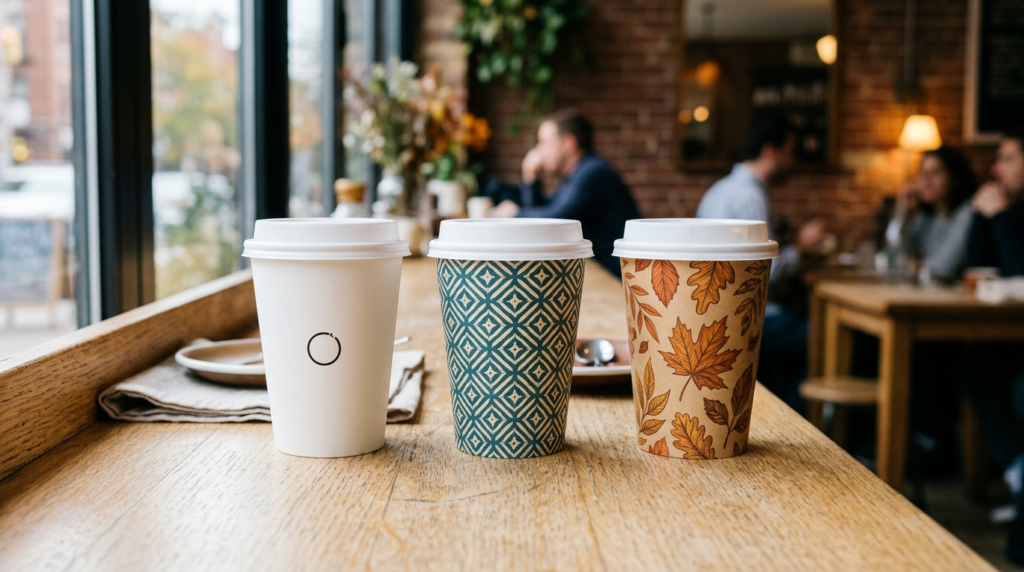
6. Repeating logo pattern. Tile the mark in a small grid. Someone turning the cup in their hand still sees the brand.
7. Coffee bean or leaf icons. A few simple drawings, same size, no extra copy. On an 8 oz cup, oversized icons start to collide.
8. Stripes. Vertical or diagonal bands in the brand colors. You don’t need an illustration to stop a white cup looking like stock.
9. Geometric shapes. Circles, waves, blocks of color. This sits more naturally in a student neighborhood than in a quiet specialty bar.
10. Hand-drawn doodles. Pastries, the storefront, a local landmark. They only look deliberate if the line weight stays the same.
Seasonal and limited runs
11. Fall cup. Oranges, browns, a leaf or two for the pumpkin-spice stretch. Regulars notice a cup they haven’t held before.
12. Holiday cup. Winter artwork in your colors, not a generic red and green. It should still look like your shop in January.
13. Iced-drink cup. Brighter print, and a cold-brew line, for summer. Preview it on the size you actually pour iced drinks into. That often isn’t the hot-cup size.
14. Anniversary cup. “Serving the neighborhood since 2019” on a short run. People photograph a date they recognize.
15. Local event cup. A marathon, a market, a school fair. Useful for a weekend of other people’s photos, not as the year-round cup.
Interactive designs
16. Instagram handle. Print the @handle near the logo, somewhere a hand won’t cover. Only ask people to tag you if you actually reply.
17. QR code. Menu, loyalty, or online ordering. Print a test and scan it on the curved cup. A code that works on the flat file often fails near the seam.
18. Name box. A small “Name:” line for the barista. Busy counters use it. Don’t let the box grow until the logo shrinks.
19. A line only regulars get. One local joke or reference. If it needs a second sentence, it’s too long for the cup.
20. Plain cup, printed sleeve. Leave the cup as stock and put the art on the sleeve. Swapping the design is easier, and the sleeve is what people hold on a hot drink.
Not every idea needs to become a full redesign. A cafe can start with a simple logo cup, then use the same core branding for seasonal artwork, limited editions or event-specific runs. Keeping the logo, colors and typography consistent makes different cup designs still feel like the same brand.
What we see when cafes design cups
A few practical points come up again and again in our cup editor:
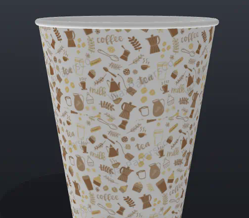
- Preview on the 3D cup, not only the flat template. On a 12 oz hot cup, artwork near the edges wraps around the curve. The 3D preview shows how the logo sits and whether details disappear near the seam.
- Choose single-wall, double-wall or ripple-wall first. Single-wall cups are commonly paired with a sleeve for hot drinks, while double-wall and ripple-wall constructions provide additional insulation. The cup type changes how the finished design looks and feels in the hand.
- Plan for every size you serve. A layout that fits a 16 oz cup may feel crowded on a 4 oz or 8 oz cup, so check each size.
- Match brand colors carefully. Many cups are printed in full color (CMYK). If exact color matching matters, share your brand colors (for example Pantone/PMS references) when you request a quote.
- Keep it simple where it counts. Simple designs can make the artwork and printing process more straightforward, and they usually read better from across a counter.
Try your coffee cup design online
Our free cup editor lets you upload your logo, change colors, add a pattern and see the result on a 3D cup before you ask for a quote:
When the design looks right, request a quote for custom paper coffee cups or custom coffee cup sleeves. Shipping within the USA is free.
FAQ
What makes a good coffee cup design?
The logo has to read from the counter, not only on your laptop. One to three colors is plenty. If the design only works when someone holds the cup six inches from their face, it won’t survive the shop.
Can I design my own coffee cup online?
Yes. The editor on this site takes a logo, a cup type, and a size, then shows a 3D preview before you ask for a quote.
What is the minimum order for custom paper cups?
500 pieces. Send the size and the quantity with the quote request.
Should I print on the cup or the sleeve?
Print on the cup if you want the branding to stay after the sleeve comes off. Print on the sleeve if you’d rather swap artwork without throwing away a run of plain cups.